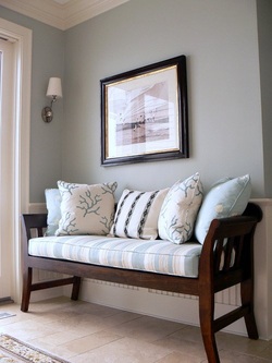
These three colors are referred to as non-colors. They provide respite within a room without changing or altering the other colors in the room(s). They also provide a bridge to all periods from contemporary to traditional design.
BLACK can be used in a subtle or in a starring role. Black and white schemes are a classic in both Interior Design and in apparel designing. As a supporting role inside the home, think of the thick slab of black granite in the kitchen, or the black wrought iron bed in the bedroom, or a black iron lamp in the living room Black is bold and sophisticated and usually looks best used in moderate or small doses.
WHITE is the choice par excellence of a non-color for creating that light and airy look. It has become the building industry's "builders' white", because white makes everything appear larger and lighter, and minor flaws almost disappear in the absence of color. Walls painted white reflect the most light in both natural and artificial light. Used on moldings, mantels, and on doors, white breaks any expanse of color and emphasizes the architectural elements in a room.
GRAY is a glamorous all-purpose neutral. Gray, a mixture of black and white, bridges any color scheme with subtlety and yet has its own presence. Think of a lamp in any room with a shiny silver base. How about the silver tea service in the dining room? Also, think of the gray sectional in the family room creating that zone of neutrality yet being "there". Don't forget the cement floors so popular now, or the satin-nickel pulls in the kitchen, or the slate or terrazzo in the bathroom or kitchen.
WONDERFUL AND VERSATILE NEUTRALS!
Tatiana Beckham
FLAIR INTERIOR DESIGN
Jean & Tatiana
www.flairinteriordesign.com
[email protected]
 RSS Feed