Flair Interior Design
Connect with us
  • Home
  • About Us
  • Interior Design
  • Home Staging
  • About Design Blog
  • Contact us

MOST PROMINENT FLOORING TREND IN 2017

1/22/2017

45 Comments

 
Picture
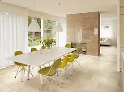
The most prominent flooring trend in 2017, and, likely for years to come is the incredible technological innovation in the production of tiles.  The new technology makes it possible to mimic countless natural and man-made materials. 


Tiles have become the ultimate masters of disguise. The look of wood in tiles, for example, is gaining great momentum in popularity. It is becoming a whole house staple, including kitchens,
bathrooms, bedrooms, living rooms, and more.  Tile is the most durable flooring option and combining that durability with the look of hardwood is a combination hard to beat. Again, it is inviting nature in the organic and natural textures.


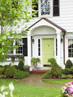
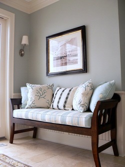
In conclusion, the theme in general for 2017 is inviting nature into our lives with paint, fabric, textures, organic and natural elements for a more "natural" living environment inside and outside our homes.


Tatiana & Jean
FLAIR INTERIOR DESIGN
[email protected]
www.flairinteriordesign.com


45 Comments

DESIGN THEMES FOR 2017

1/15/2017

45 Comments

 
Picture
The question of what types of design themes are becoming more prevalent is not a simple one to answer.  Whatever the style of the most inviting rooms or home, the themes almost always start inside someone's heart and mind.  That is why a good designer must tap into the client's taste and experiences to give him a home that nurtures and reflects who he is and what he loves.  Knowing what a client can live with can help avoid being swayed by mere fads or of the latest "what's new".  Finding what appeals most to a client, and then designing a truly personal setting that speaks to the owner's soul is what is important.  Whether the theme is mid-century modern or rustic farmhouse, for example, the theme should speak to the owner's own experience and his personality, interests, and outlook on life.  It's up to the designer to pull all those elements together to form a decorating theme that is either formal, casual, eclectic or anything in between. And good taste is never out of fashion.

Tatiana & Jean
FLAIR INTERIOR DESIGN
www.flairinteriordesign.com
[email protected]

45 Comments

COLOR FOR THE YEAR 2017

12/22/2016

26 Comments

 
Picture
Each year in the design world, a new color selection is born.  The selection of the yearly new colors is so important, because color is the nexus of most things in interior design.  


The new big thing in color for 2017 is dark green, along with jewel tones.  The color green is the symbol of environmental consciousness and is a must have color in paint, fabric, and upholstered furniture.  Green goes well with tan leather, natural linens and brass.  Used on cushions and decor items, it adds depth and brings the
outdoors in.  This trend of bringing the outdoors in (and incidentally the indoors out) will continue in 2017.  It contributes to a feeling of being aware and of being part of nature and living in an environment of communing with nature as closely as possible.


Pantone color of the year for 2017 is the lime green GREENERY.  It is described as "nature's neutral", and spring-like.  It invokes restoration and renewal.


Tatiana Beckham
FLAIR INTERIOR DESIGN
[email protected]
www.flairinteriordesign.com 
410-271-1261
443-871-3642


26 Comments

FLOWER POWER

11/23/2016

34 Comments

 
Picture
FLOWERS arranged beautifully in a home will bring your rooms to life!


Now that fall is coming to an end, and your garden is
dormant, it might be easy to forget how much power and spirit flowers add to your rooms.


The local florist will be delighted to assist you, as well as just even picking up a bunch of colorful flowers at the supermarket.  However you want, but just make it happen!!  


A beautiful arrangement not only will bring life to your rooms but bring you joy!  Remember... "A thing of beauty is a joy forever"!


Jean & Tatiana
FLAIR INTERIOR DESIGN
flairinteriordesign.com
[email protected]

34 Comments

SO YOU WANT TO PAINT YOUR WALLS WHITE!

10/8/2016

0 Comments

 
Picture
We Interior Designers are ready with great COLOR RECOMMENDATIONS when our clients want to paint their walls with a shade of white, of which there are many!   We have it narrowed down to the following ones that never disappoint.  Here they are....

Benjamin Moore - Simply White - walls and ceiling
It is a beautiful, natural shade that works well with any gray tone.  Trim and Doors:  Benjamin Moore - Thunder
for contrast.

Benjamin Moore - White Crest   It has very slight gray undertones.  It keeps a room from feeling cold or icy.

Farrow & Ball - Pointing    A wonderful classic white with a hint of warmth - a warm white without veering to  yellow.  Farrow & Ball is composed of healthier low-to-no-VOC formulations, depending on the sheen level.  So
you are designing in a healthy and environmentally conscious way.   For trim - Decorators White by Benjamin Moore.  It is a true bright white that never disappoints.  It never seems to fight with any chosen wall color.

Benjamin Moore - Monroe Bisque...another good white
                             Super White - clean, crisp white that 
                             adds a nice contrast against other 
                             whites.  It can be used on cabinets 
                             and trim.
                             Chantilly Lace - reads cool and it is 
                             clean and crisp.
                             Swiss Coffee - It's a warm white that
                             doesn't go to yellow or almond.  It is
                             a nice, crisp white with warm 
                             undertones.

For Trim:  If walls are a cool color (blue, gray, purple)
select a cool white trim.  If walls are a warm hue (red, pink, brown, orange, or yellow) select warm white trim.

Hope you find out tips helpful today!

Jean & Tatiana
FLAIR INTERIOR DESIGN
[email protected]
www.flairinteriordesign.com 


0 Comments

CURB APPEAL:  THE VIEW FROM THE STREET

8/10/2016

10 Comments

 
Picture
This is the season during the Spring and Summer months when more people are trying to sell their homes.  Home owners are told by their real estate agents that they need to make sure that their homes have curb appeal.     As Interior Designers and Stagers, we at                 FLAIR INTERIOR DESIGN have our views of what we mean specifically by curb appeal.


We tell home owners that the outside of the home as well as the inside of the home should appeal to the greatest number of potential buyers.  The more people who visit the home, the faster it will sell for the best price.


The buyer driving by and viewing the outside of the home should be intrigued enough to want to see what is inside!
Here are a few basic pointers for achieving the most curb appeal:


FROM THE CURB an overgrown yard detracts from the home.  Mow the lawn, weed the yard, mulch the beds, prune the plants and trees, blow or sweep the driveway and walkway.  In other words, a well-manicured yard is very appealing.  It makes that important first impression that the home is in move-in ready condition.


REMOVE THE CLUTTER.  Park trash cans in the garage, remove plastic whirligigs and take away the garden gnomes and the children's toys.  Let the trees, shrubs and flowers in the yard speak for themselves.  They do this so eloquently and beautifully.


THE FRONT DOOR is the focus of the outside of the home and should be interesting and distinctive with a fresh coat of paint.  Flowering containers near the door give a nice splash of color and a nice welcome to guests and buyers.


DECKS, patios, and porches are the outdoor living spaces for fun, relaxing, and dining with friends and family.  They should be maintained and decorated, since they are a great selling point.  They offer the extra "plus" of a beautiful and well-maintained home.


Tatiana & Jean
FLAIR INTERIOR DESIGN
[email protected]
www.flairinteriordesign.com


10 Comments

DESIGNING WITH NEUTRALS: BLACK & WHITE & GRAY

6/21/2016

20 Comments

 
Picture
Although black, white and gray are not featured on the color wheel, they play and important role in Interior Design.
These three colors are referred to as non-colors. They provide respite within a room without changing or altering the other colors in the room(s).  They also provide a bridge to all periods from contemporary to traditional design.

BLACK can be used in a subtle or in a starring role.  Black and white schemes are a classic in both Interior Design and in apparel designing.  As a supporting role inside the home, think of the thick slab of black granite in the kitchen, or the black wrought iron bed in the bedroom, or a black iron lamp in the living room  Black is bold and sophisticated and usually looks best used in moderate or small doses.

WHITE is the choice par excellence of a non-color for creating that light and airy look.  It has become the building industry's "builders' white", because white makes everything appear larger and lighter, and minor flaws almost disappear in the absence of color.  Walls painted white reflect the most light in both natural and artificial light.  Used on moldings, mantels, and on doors, white breaks any expanse of color and emphasizes the architectural elements in a room.

GRAY is a glamorous all-purpose neutral. Gray, a mixture of black and white, bridges any color scheme with subtlety and yet has its own presence.  Think of a lamp in any room with a shiny silver base.  How about the silver tea service in the dining room?  Also, think of the gray sectional in the family room creating that zone of neutrality yet being "there".  Don't forget the cement floors so popular now, or the satin-nickel pulls in the kitchen, or the slate or terrazzo in the bathroom or kitchen.

WONDERFUL AND VERSATILE NEUTRALS!

Tatiana Beckham
FLAIR INTERIOR DESIGN

Jean & Tatiana
www.flairinteriordesign.com
[email protected]


20 Comments

DESIGNING YOUR OUTDOOR SPACE

5/14/2016

23 Comments

 
Picture
Now that summer is upon us once again, we are all looking forward to using our outdoor spaces more frequently.  Why settle for a dull designing scheme?

Designing a patio, veranda, terrace or any outdoor space presents the same challenges and opportunities as any interior space.  Lighting, artwork rugs, furniture, accessories - all create a sense of place.  All those elements which create a successful interior can be used in an outdoor space as well.

For example, why use an uninspired and bland set of matching outdoor furniture, when for maximum interest you can blend and layer some old pieces with new, for a more interesting space.  After all, you are building a unique space with your personality in mind.  Remember though, if you want to combine a range of styles for an eclectic look, it is better to work within a neutral color palette where you can add pops of color for interest.

New materials for the outdoors, because of new technologies, have made fabrics, metals, wicker, and wood able to withstand the elements and retain their colors better and longer.  So, go forth and smell the roses and relax in your beautiful outdoor space. 


Tatiana Beckham
        &
Jean Phillips

FLAIR INTERIOR DESIGN
www.flairinteriordesign.com
[email protected]


23 Comments

BRING YOUR PART OF YOUR SPRING FLOWERING BUSHES AND TREES INSIDE!

4/21/2016

6 Comments

 
Picture
6 Comments

March 16th, 2016

3/16/2016

8 Comments

 
Picture
8 Comments
<<Previous
Forward>>

    About Design

    Author

    Jean Phillips and Tatiana Beckham - designers dedicated to beauty, comfort and style.

    Archives

    July 2019
    April 2019
    January 2019
    December 2018
    October 2018
    June 2018
    April 2018
    February 2018
    January 2018
    November 2017
    September 2017
    July 2017
    May 2017
    April 2017
    February 2017
    January 2017
    December 2016
    November 2016
    October 2016
    August 2016
    June 2016
    May 2016
    April 2016
    March 2016
    February 2016
    January 2016
    December 2015
    November 2015
    September 2015
    August 2015
    July 2015
    June 2015
    May 2015
    April 2015
    March 2015
    February 2015
    January 2015
    December 2014
    November 2014
    September 2014
    July 2014
    June 2014
    May 2014
    April 2014
    March 2014
    February 2014
    January 2014
    December 2013
    November 2013
    October 2013
    September 2013
    August 2013
    July 2013
    June 2013
    May 2013
    April 2013
    March 2013

    Categories

    All
    Design Tips

    RSS Feed

Site powered by Weebly. Managed by JustHost
Photo from cea_bugg_4